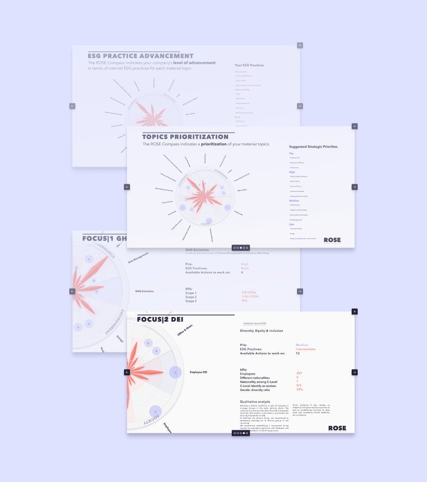
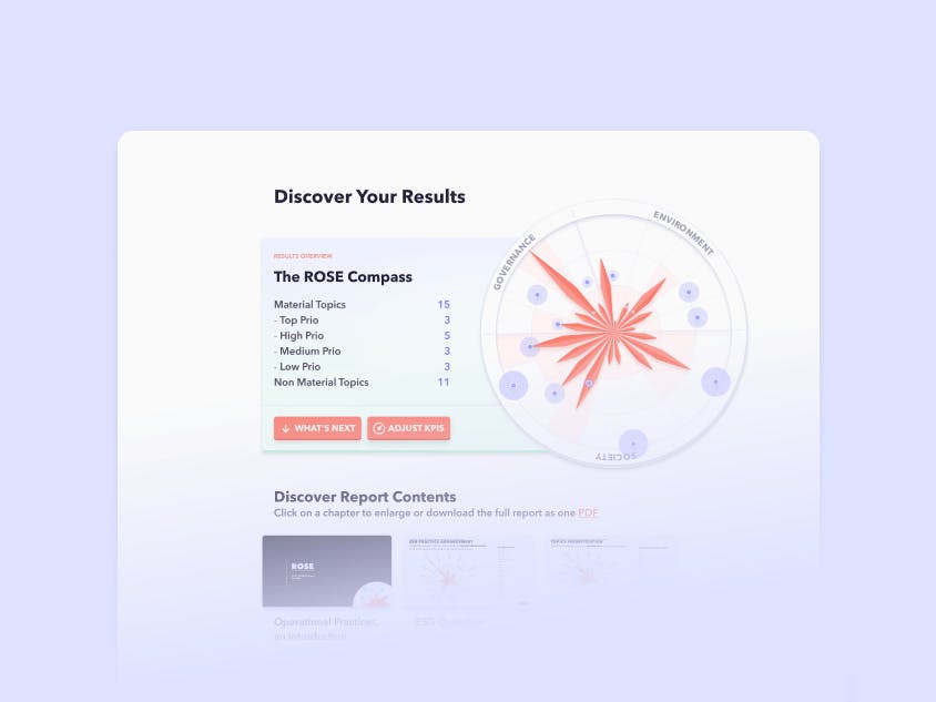
We were working on the later steps in our 'Getting Started' flow. The most important users of a workspace were set up at this point and had also completed a first assessments, allowing us to do a double materiality evaluation on their resulting topics' priorities and practices in reference to the current ESRD standard and to the custom needs of the our customer.
Before allowing users to access the entire platform, we wanted to educate them about the various topics that were created, their respective practices and priority scoring, and how to read and compare them.
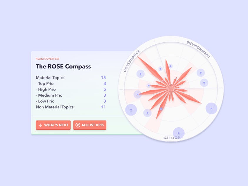
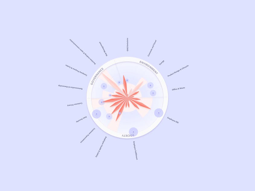
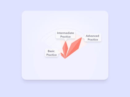
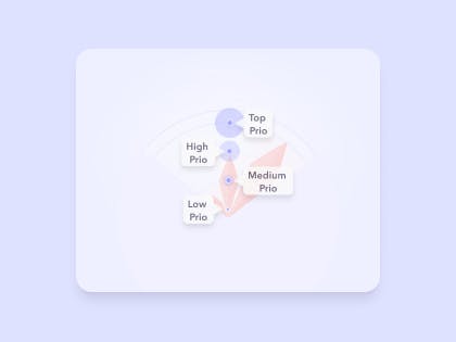
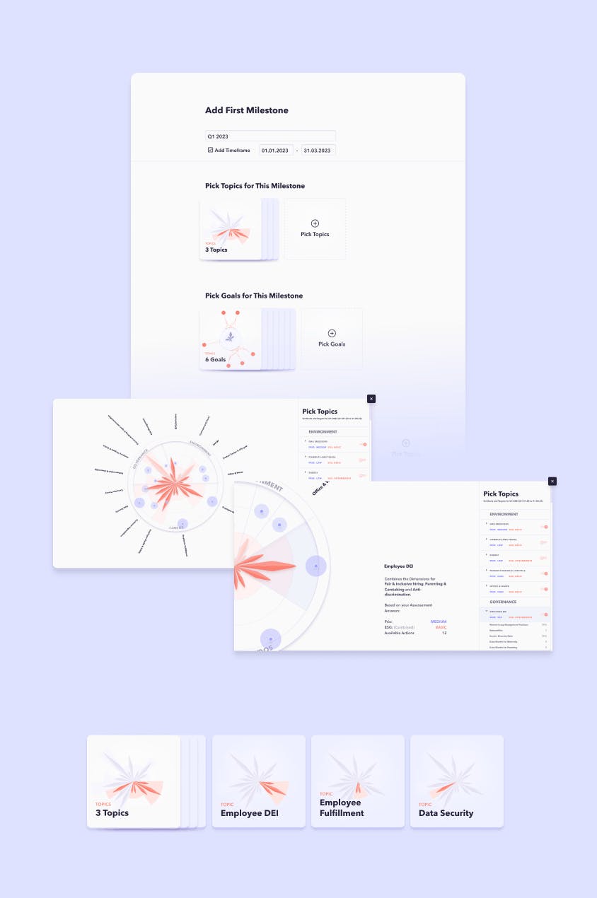
Users should also receive an introduction on how to start planning their improvements in the form of milestones, which would heavily relate not only to topics but also to goals and actions, available after the assessment.
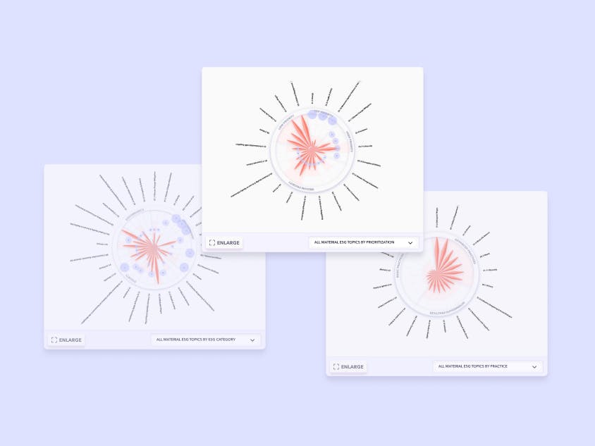
We tried different approaches to give an interactive overview to the concept of milestones and prompt the user on picking and setting a few first actions and goals with mixed results. The representation in card stacks worked well to provide an expectation of the resulting page structure for goals and actions. But we tried also to include these data points into the compass chart, wich ultimately failed due to the variety of data. The more data we tried to add on top of the same chart the harder it became to deliver a condensed overview.
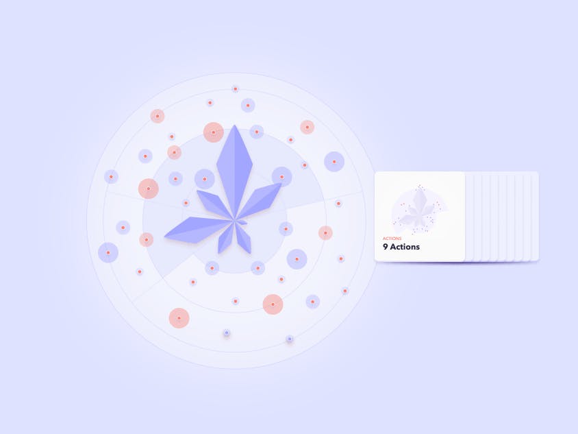
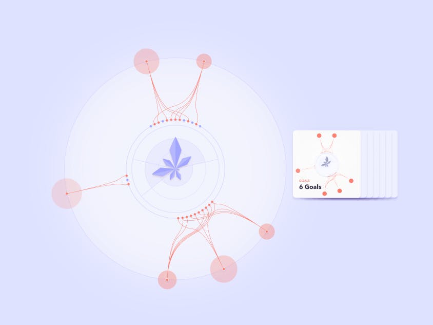
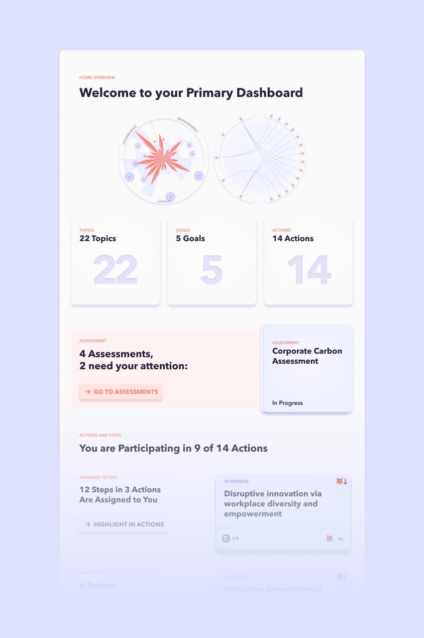
While we got positive feedback on the interface elements as well as the idea of an extended chart, the concept of milestones was not universally applicable enough to our users needs. We moved on to the dashboard, cutting the step for setting a first milestone and utilizing the elements that worked well in the dashboard and other views.
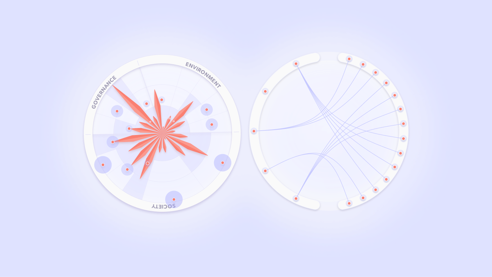
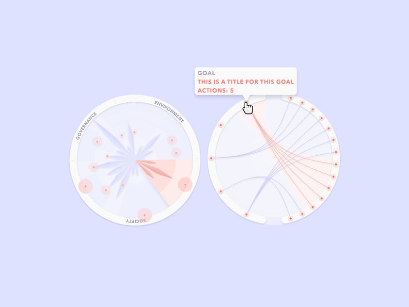
Additionally we gave another try to the chart, wich we wanted to be a central element throughout the app. This time we tried not to use one large chart showing everything, but using multiple more dedicated charts. We set the proven compass chart (showing topics practices and materiality) next to a radial chord diagram and connected both charts, by highlighting connected data when the user was interacting with it.
